Google to experiment with more desktop search changes after favicon/black ad label rollout
Expect more changes to how your search snippets in Google search are rendered on desktop.
Positive results. Google told Search Engine Land with the mobile rollout that happened several months ago, that “design has been well received by users on mobile screens, as it helps people more quickly see where information is coming from and they can see a prominent bolded ad label at the top.”
With the desktop rollout from a week or so ago, Google said that “early tests for desktop were positive, we are always incorporating feedback from our users.”
More changes to come. Google said “we are experimenting with a change to the current desktop favicons, and will continue to iterate on the design over time.”
Google said “Our experimenting will begin today. Over the coming weeks, while we test, some might not see favicons while some might see them in different placements as we look to bring a modern look to desktop.” In fact, we saw some tests of this earlier today.
Google’s statement. Here is the statement Google sent us:
“We’re dedicated to improving the desktop experience for Search, and as part of our efforts we rolled out a new design last week, mirroring the design that we’ve had for many months on mobile. The design has been well received by users on mobile screens, as it helps people more quickly see where information is coming from and they can see a prominent bolded ad label at the top. Web publishers have also told us they like having their brand iconography on the search results page. While early tests for desktop were positive, we are always incorporating feedback from our users. We are experimenting with a change to the current desktop favicons, and will continue to iterate on the design over time.”
Google’s post on Twitter. Google also just posted this on Twitter:
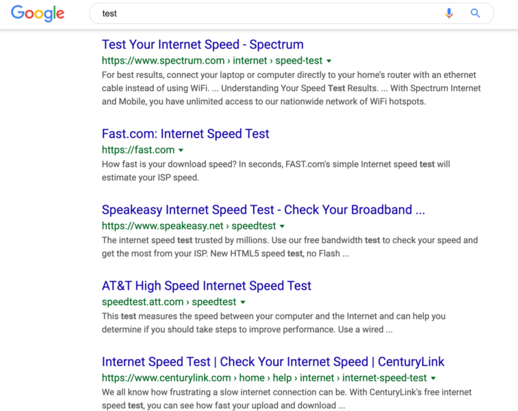
Before. Here is a screen shot of what the desktop search results looked like before this change:

After. Here is what this looks like now, with the favicons:

Why we care. When this rolled out on mobile, the SEO and SEM community were not too happy with the change. But now that it rolled out on desktop, it appears a wider audience is less happy with the change. Many publications have covered their dissatisfaction with the new design and it seems Google has heard this feedback. It is not just SEOs and SEMs complaining but a wider set of searchers and Google users.
This change does impact your click-through-rate on your Google Ads and organic/free listings. So as Google continues to experiment and change the way the snippets are displayed, your traffic may be impacted in some way.


