Dear Google: Here’s a search marketers’ AdWords UI wishlist
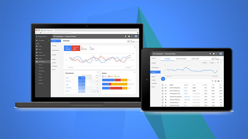
With Google announcing a new AdWords user interface is in the works, Search Engine Land asked paid search marketers for their top requests.
 Last month, Google teased a new look for AdWords. The company has said it will be working on redesigning the user interface over the next year or so. Throughout the process, Google will be reaching out to all types of advertisers — from local businesses to large agencies — to get feedback on proposed changes.
In that spirit, Search Engine Land reached out to paid search marketers to get their top wishes for the new AdWords UI. Generally, marketers we spoke to said they are pretty satisfied with the existing UI (considering how it stacks up against the UIs of newer ad platforms) but are optimistic about the update.
“Overall, I’m happy with the current design, but admit it’s become unwieldy as the years have gone on and more has been added. I can’t wait to see what they come up with!” says Melissa Mackey of Gyro.
Unwieldy, difficult to find what you’re looking for, confusing to set up certain types of campaigns — these were common themes.
Brad Geddes, of Certified Knowledge and Adalysis, has been in paid search longer than just about anyone, but like many, he doesn’t actively use the interface every day. “I’m a heavy API user so I mostly go to AdWords for simple things; to double check items; or to work on items that aren’t in the API. So when I go to the UI it’d be nice to have a system that allows me to easily get things done and not have to wait and hunt to accomplish a task.”
In this way, Geddes reflects the challenges that newer AdWords users — from junior account managers to business owners managing their own accounts to those using third-party management systems, have when navigating the interface. It can be easy to get lost in all the layers when you’re not living in it.
From functionality improvements to new features, here’s what paid search marketers hope to see.
No more system hang-ups, please
 The dreaded “red bar of death” comes in a few variations, none of which are welcome.
“My top wishlist item is to actually get things done,” says Geddes. “I can’t count the days that I see the message ‘There is a new version of the interface available; please refresh the page,’ and nothing happens when you refresh except to keep seeing that message and waste lots of time trying to do something simple.”
Or, as Aaron Levy of Elite SEM succinctly put it, “Stability! No more red bar of death.”
Another issue is just general system speed. “One thing we’re hoping for is to see an increased speed in the interface when dealing with accounts that contain a large amount of data,” says Rebekah Schelfhout of Merkle. “These have at times been slow to load and it would help to speed up analysis and optimization.”
“I also would like to see the interface faster,” Geddes adds. “Google can cache a lot of pages; make the navigation a bit easier, and make it so it’s just faster and easier to get things done.”
Simplicity for easier management & analysis
Greater simplicity was echoed by just about everyone we heard from, with one notable exception. With AdWords encompassing search, display, shopping and video campaigns, the options for analysis and setup have become cumbersome.
Larry Kim, of WordStream, pointed out a couple of areas where this rings especially true. “Setting up Gmail Ad campaigns is rather confusing, and I usually get lost in all the display targeting options.”
Aaron Levy, of EliteSEM, wants to see channel-specific tabs. “I was excited when they added YouTube under the AdWords roof, but now we’re up to a million columns to choose from. Interactions vs. clicks vs. views vs. impressions, etc. Separating the management portions could help a great deal.”
Then there is the issue of having to continually repeat filter settings when navigating across tabs. “It feels cumbersome to have to filter for Enabled parent fields the way the interface makes you do it now,” says Susan Wenograd of Five Mill. “For example, if I want to see Keywords only in live Campaigns or Ad Groups, I have to go to the Campaigns tab and Ad Groups tab to toggle the view there first. I would love it if I could easily check/uncheck those from whatever tab I’m in.”
Steve Cameron, of Advent, is concerned, however, that simplifying the interface will mask the actual complexity involved in managing Adwords campaigns. “The problem is (in my opinion) that Google are continually trying to make the platform more accessible whilst at the same time the reality is that it is becoming increasingly complex.”
This echoes a long-standing concern, that making AdWords look and sound too easy sets up companies to fail. “A newbie competing against even an average PPC marketer will be eaten for breakfast,” says Cameron, who “would prefer to see the UI becoming more intimidating and more realistically reflecting the true nature of the beast.”
Surfacing insights faster, with more visualizations
One of the big changes that stands out in the screen shots Google has shown of the UI update so far is the incorporation of more charts and graphs. For the most part, marketers are looking forward to the use of more visualizations.
“We’re looking forward to being able to see key platform insights at top level without having to deep-dive to see things like the performance of mobile vs. desktop,” says Schelfhout.
“I’d say the biggest thing I’d like to see in the redesigned AdWords UI is new ways to visualize and interpret data,” says Maddie Cary, of Point It. “I think the features they’ve rolled out in the last year to the Reporting section, as well as to the Display tab, better allow advertisers to conceptualize their performance and figure out where to take optimization action. Where should I prioritize? Which device is performing best? Where did I see a major drop in conversions?”
Kirk Williams, of Zato Marketing, says he’s happy to see a visual facelift, but doesn’t want Google to go too far. “I don’t want to lose access to the spreadsheet look. I would settle even for something as simple as shading every other column slightly so the eye more easily follows lines. In some clients, I have 16+ columns to analyze briefly, and it would be easier if my brain could more easily tell each row apart.”
Williams was the only one who mentioned AdWords Editor. “I would love for the UI and Editor to become more visually similar. It would be nice to have similar processes, so my muscle memory would kick in easily wherever I am working at the time.”
It’s interesting to think about how the changes Google makes to the web interface will impact our experiences with Editor, as well as third-party management tools — not to mention Bing Ads, which has gone to great efforts to make it easy for AdWords users to get around that interface.
Simplicity doesn’t mean we don’t also want more features
While navigational streamlining was a common theme, marketers would like to see some new features and functionality get added, of course. Some of these may be outside the scope that AdWords Product Management Director Paul Feng and his team are working with for the UI overhaul, but it doesn’t hurt to ask.
Mackey would like AdWords to take a page from Google Analytics and add the ability to add annotations to the graphs. This has long been a popular feature request. Maybe this is the time.
Levy wants to see more segmentation options without having to download spreadsheets. “Currently once you dive down more than two segments deep you have to download. Why can’t I see mobile performance by time of day in the UI?”
“I hate that custom columns/custom calculations are only down to the Ad Group level,” adds Wenograd. “Getting them down to keyword (and even search query) level would be awesome.”
More attribution and conversion measurement levers
Several marketers put getting more attribution and conversion data insights at the top of their lists.
“My wish is all about conversions,” says Steve Hammer, of Rank Hammer. “I’d love to have additional models and methods for conversion tracking. Last Adwords Click isn’t the preferred model for most clients with longer sales cycles. It also massively overvalues remarketing, which by definition had some other assist that may or may not have had a cost.
“I’d also love to be able to find a way to import other conversion and/or cost sources as you can do with Analytics,” adds Hammer.
Wenograd would like to see more for those uploading offline conversion data into AdWords. “It would be great if GCLID data could be updated for sales cycles that evolve when you rely on it for offline conversion tracking. For example, right now when you upload offline data, it basically ignores any new entries with a GCLID and time stamp that already exist. So if someone signs up for, say a $20/mo. package, and then later upgrades to $40, you can’t update the data to reflect that. It would be amazing if you could have the option to add or overwrite any existing records tied to a GCLID when you uploaded.”
Levy wants to be able to set weighting for view-through conversions. “Right now we have no ability to change the weight put on view-throughs in the interface; we know counting them all is wrong and we know counting none is wrong. Let us decide what counts.”
Matt Umbro, of Hanapin Marketing, would like to see attribution data for search queries. “Currently, you can only see assisted conversions for the actual keywords, but not what triggered these terms. Having this extra data not only for Search campaign keywords, but for Shopping queries, as well, would be highly beneficial.”
Lastly, Larry Kim would like AdWords to see a feature that could “make CPCs go down by 50 percent. (ha ha). I envision a big red ‘Sale’ button in the interface.” Get on that, Google.


