3 signs your landing page copy is leaving your visitors high and dry
Are your PPC landing pages failing to convert, despite getting great traffic? Columnist Khalid Saleh explains why your landing page copy might be to blame — and how you can fix it.
There are few things more important for conversion rate optimization than your landing page copy. If your landing pages are struggling to turn visitors into leads, there’s a very good chance it’s because of your copy. More often than not, marketers are guilty of making several copywriting mistakes, and they don’t even know it.
In this post, I’ll show you three copywriting mistakes you are probably making on your landing pages — and how to correct them.
1. Your copy focuses on features, not benefits
Features tell your audience what your product is about.
Benefits tell them what your product can do for them.
Although features are important — they educate customers about your product’s specifications — they are purely informational. They don’t really persuade users or tell them how their lives will change by buying your product.
To understand why this works, you need to understand how your customers make purchase decisions. While we’d like to assume that we make rational decisions after careful analysis, the truth is that for most of us, purchase decisions are driven by emotion, not logic. Humans make decisions emotionally, then look for logical reasons to back these decisions up.
For example, a customer might decide to buy an iPhone because its design appeals to him emotionally. But to justify his decision, the customer might look at the iPhone’s features — the battery life, camera quality, processor speed and so on.
This is why, rather than telling your customer what they can have, tell them why they need it and how it can help make their world better.
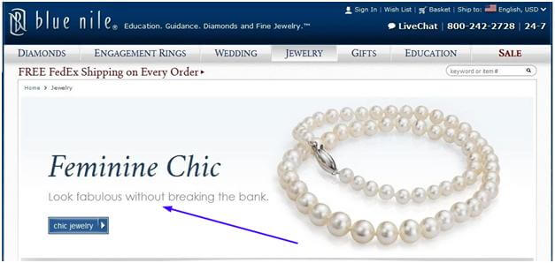
In our post-solution selling era, it is more important than ever to highlight benefits over features in your landing page copy. For example, Blue Nile, a jewelry retailer, uses benefits-driven copy on its home page:
The above copy informs viewers that they will “look fabulous without breaking the bank” — clear benefits to customers.
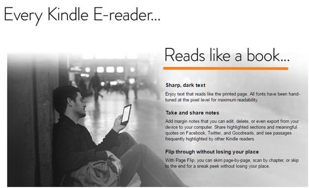
Benefits-focused copy works for most product categories. For example, the Amazon Kindle Voyage page highlights how the Kindle “reads like a book.” Only after mentioning this benefit does the copy go further into the features that make this possible.
Creating benefits-focused copy can be challenging since you need to know exactly what your customers care about. In the above example, Amazon knew that a reading experience that was close to a paperback book was important, hence the focus was on the fact that their product “reads like a book.”
There is a formula that works well for landing pages — focus on a benefit, and back it up by talking about the features that make it possible.
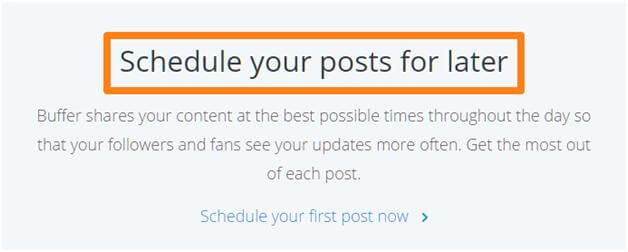
To give another example, Buffer’s home page mentions the product’s key benefit: It helps you manage social media better.
Only once you scroll down the page do you see the feature(s) that make this possible, such as the ability to schedule posts for later.
Putting the benefits front and center acts as a powerful motivator for customers to take action. Try doing something similar for your landing page — identify a benefit, then back it up with features.
2. Your copy is superfluous
One of the biggest mistake amateur copywriters make is creating copy that is superfluous. It is either too long or too reliant on filler words that may sound impressive but ultimately don’t do anything to persuade readers.
Remember: Good copy is always about good messaging. It doesn’t matter whether you write 10 words or 10,000 — unless your messaging is clear and to the point, you will struggle to convert visitors.
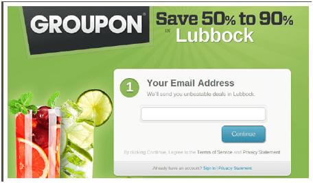
Take a look at Groupon’s clear messaging as an example:
Groupon isn’t selling an “experience” or some high-end product. It is simply offering deep discounts — 50 percent to 90 percent off — on products and services. Instead of pushing some vague and superfluous benefit, the copy is simple, clear and forthright.
Also note how the copy matches the landing page goals. Groupon isn’t trying to convince you to fork your credit card over for an expensive purchase. It simply wants your email. Writing lengthy copy for such a low-friction task would be wasteful.
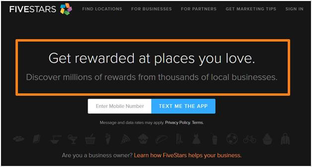
Here’s another example of clear copywriting from FiveStars.com:
Instead of writing hundreds or thousands of words telling customers how FiveStars will change their lives, the landing page simply tells readers what the app is about and how it can benefit them.
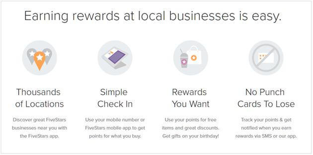
Scroll further, and the copy will tell you about the service’s other benefits without wasting a single word.
If you want your copy to be effective, be prepared to edit for brevity. Be as clear as possible. Tell readers exactly what your product does and how it can change their lives. Unless you are selling lifestyle products (where fluff can actually help), you’ll find that this will push your conversion rates up.
3. Your copy is “too mathematical”
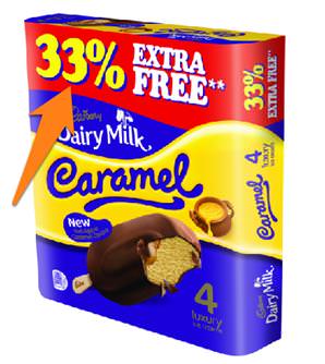
Let’s try out a test: Suppose you enter a coffee shop and see two offers. One offer gives away 33 percent extra coffee. Another gives a 33-percent discount on the price.
Assume that, before the offer is applied, each cup costs $3 and contains 300 ml of coffee. Which of these offers do you think provides a better value?
The answer? It’s offer B. Offer B gets you a 300-ml cup of coffee for $2, while offer A gets you a 400-ml cup for $3. If you wanted to buy $6 worth of coffee, you could get 900 ml with offer B and only 800 ml with offer A.
As you might imagine, many customers will fail to make the correct choice, simply because most people are bad at understanding fractions and percentage discounts.
For example, a study published in the Journal of Marketing found that people are happier to get something extra “for free” than to get the same thing at a lower price. This is why you see so many companies offering an “extra 20 percent” on their products instead of simply dropping the price by an equivalent amount.
For copywriters, the implications of this are many. When you’re talking about numbers — discounts, total users, prices and so on — it’s always better to explain exactly what the numbers signify. Don’t just tell people that you’re giving them 33 percent off; show them how this will impact their final payment.
For example, Amazon doesn’t just tell you that it’s giving you a discount — it shows the original price, the current price, and the total discount in absolute figures.
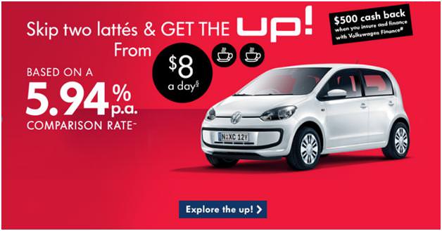
Another example is to reframe prices into something consumers can understand.
For example, this ad reframes prices in terms of daily cups of coffee. $8/day (which is still understandable) at 5.94 percent p.a. (a number most consumers will struggle with) is arbitrary and difficult to figure out. But “two lattes” is something customers understand readily.
Yet another tactic is to reframe a discount into something visitors appreciate, such as free shipping. Recall the study we saw earlier: Customers prefer getting something for free over getting a discount.
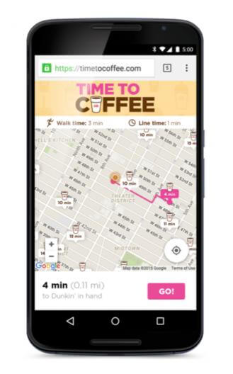
Poor mathematical understanding isn’t limited to money and discounts alone. It can also be applied to things like distances. Dunkin’ Donuts, for example, created a website to reframe distances in terms of time.
To many, “0.11 miles away” sounds arbitrary, but “4 minutes away” is something consumers can easily process.
Over to you
Creating effective landing page copy is a big challenge, but it isn’t insurmountable. By focusing on best practices, cutting down on superfluous words and creating a clear, precise message, you can cut through the noise and reach your audience where it truly matters.
Here’s what you should take away from this post:
- Focus on how your product can improve your customers’ lives, not its features alone.
- Make your website copy and offers easier to understand.
- Be clear in your messaging; remove all superfluous copy.

